Abbott Dental
Brief
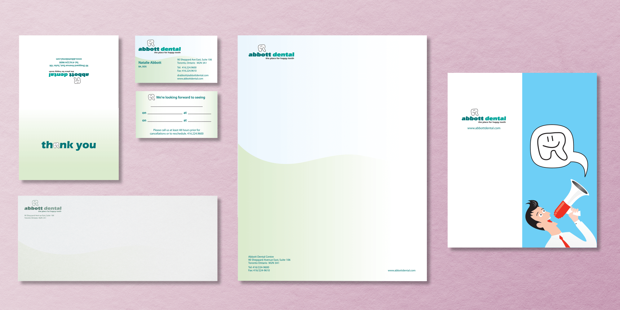
With the regular sound of laughter coming from the operatories, this is not your typical dental practice. And that’s how Dr. Natalie Abbott and her team like it. From the day it opened in 2004, the goal has been to make every patient feel more than just welcome – to feel they are among friends who care. And with Disney and comic styled artwork throughout the office, Dr. Abbott wanted her marketing to reflect her style, beliefs, and values.
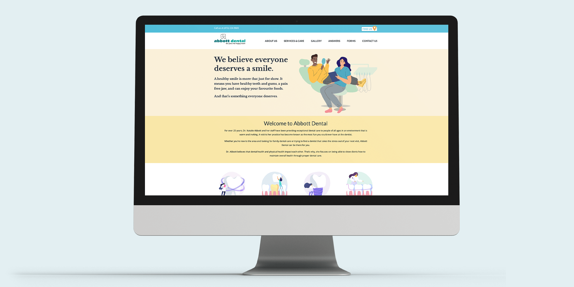
Marc and his team set out to break the mold of how a dental website should look. Using bright pastel colours, warm design elements, and simple messaging, they presented Abbott Dental as the best alternative to “medical” looking dental practices that focused more on the dentist than the patient.
The result has been continued double digit growth for over 20 years. And a lot of “happy teeth”.
Projects
Brand identity
Copy writing
Graphic design
Photography
Website design
Print materials
Signage
